In the spring of 2012, the design studio Barnbrook faced an unenviable dilemma: how to brand a product that had spent more than 40 years consciously resisting all branding? The product was David Bowie. More specifically, Jonathan Barnbrook and Jonathan Abbott were tasked with developing a graphic look for the Bowie exhibition due to open at the V&A in London the following year, the summation of a life like no other.
But how best to portray Bowie in a manner both strikingly new and instantly familiar? One answer was colour: the whole look of the show would be awash with orange — the orange of Ziggy Stardust’s hair, the orange of Low. Another solution would be a typeface for the signage needed to guide the visitors through the show and adorn the promotional posters and merchandise. Here, the choice was less obvious. Initial thoughts turned to past album covers (Barnbrook had worked with Bowie on his record sleeve designs since 2002). Perhaps the chunky ITC Zipper typeface suggestive of Hunky Dory, or the spangly 1950s Cristal lettering of Aladdin Sane? But that would have fixed the look to a particular sound and time.
There was brief consideration of using Johnston, but that was forever linked to London’s Underground. The designers experimented with a varied typographic palette in an attempt to reflect all the different elements in the show — photography, costumes, memorabilia, handwritten lyrics. But here again there were problems defining such a visually aware artist: Futura would have suited his early space-bound phase much better than his Let’s Dance period; Times New Roman or Baskerville would have penned him in as a traditionalist, and Bowie was anything but that. And then the designers realised they needed one strong, distinctive visual language to tie everything together. So they chose Albertus.
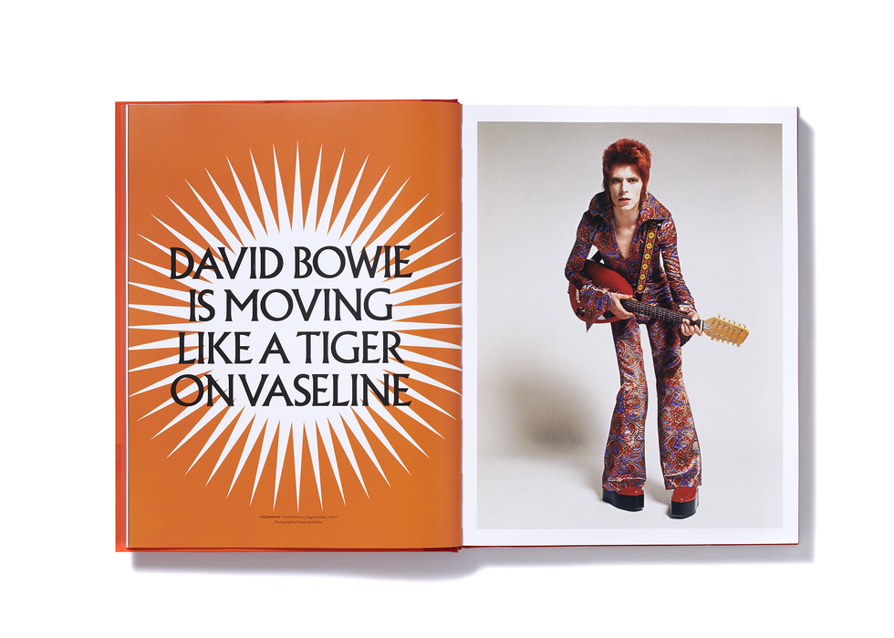
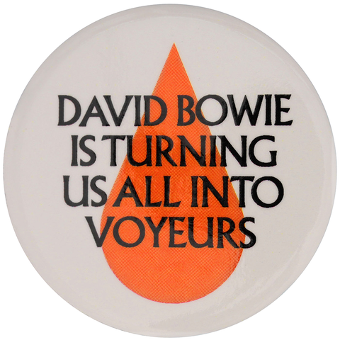
Looking back now — flipping through the catalogue and those full graphic spreads emblazoned “David Bowie is Forever and Ever”, “David Bowie is Moving like a Tiger on Vaseline”, and the pin-badges in the shop that proclaimed “David Bowie is Turning Us All into Voyeurs” — one wonders how anyone could possibly have chosen anything else. Bowie’s name appears particularly electrifying in the typeface’s capitals: the B that tapers to a fine point around its belt, the tilting O with its cavernous bowl, and the chiselled E with its angled arms like a warrior facing battle. Its letters are distinguished by a solid warmth and the subtle grounding of its serif legs. It boasts a carved quality, as if it could never be removed once installed. Its slight imperfections withstand digitisation and add to
its vulnerability.
The choice of the typeface had an effect far beyond the intentions of the designers. When Bowie died in January 2016, with the exhibition mid-way through its tour of Barcelona, Tokyo, Melbourne and Brooklyn, Albertus transitioned from being part of his life to his afterlife.
“It’s hard to imagine it now,” Jonathan Abbott says, “but I recall being at a meeting at the museum where concerns were raised that a sponsor might not be found due to the colourful life of its subject. Bowie’s life and work was considered an unconventional subject for a museum show — should it even be in a museum at all? So, it was incumbent on the design to make it clear that, yes, the subject was indeed culturally significant. We wanted to create a vibrant pop object, but we also wanted it to speak with a certain gravitas and I think Albertus helped us do that — echoes of stone-carved lettering making it feel almost monumental.”
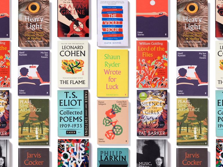
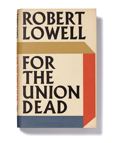
Wouldn’t have been the first time. Before Bowie, Albertus had already acquired quite a reputation. On my virtual bookshelf I have: The North Ship by Philip Larkin, The Flame by Leonard Cohen, One Hundred Lyrics and a Poem by Neil Tennant, The Hawk in the Rain by Ted Hughes, American Histories by John Edgar Wideman, Come Rain or Come Shine by Kazuo Ishiguro, The End of the Affair by Graham Greene, Lord of the Flies by William Golding, How to be Invisible by Kate Bush, The Violet Hour by Katie Roiphe, The Entertainer by John Osborne, Preoccupations by Seamus Heaney, May Week Was in June by Clive James, Grief is the Thing with Feathers by Max Porter, Mother, Brother, Lover by Jarvis Cocker, Paradise by Edna O’Brien, Mostly Hero by Anna Burns, My Son the Fanatic by Hanif Kureishi, Wrote for Luck by Shaun Ryder, For the Union Dead by Robert Lowell, Music, Sense and Nonsense by Alfred Brendel, Paris Echo by Sebastian Faulks, The Silence of the Girls by Pat Barker, Collected Poems 1909–1935 by TS Eliot, Pearl by Simon Armitage, Mr Salary by Sally Rooney. All in Albertus. That’s just the top row. The majority of these books were published by Faber; the ones that weren’t just look as though they were, or wanted to be.
Next to the bookshelf lies a pile of things: posters for Jean-Luc Godard’s Breathless, Roy Lichtenstein at the Guggenheim, the BBC version of Hilary Mantel’s Bring Up the Bodies, The Thing by John Carpenter, Madam Butterfly at the Royal Albert Hall, a tote bag from Waterstones in Piccadilly, a plastic bag from Queen Street Laundry, a Sainsbury’s egg carton, a DVD of The Prisoner, Parachutes by Coldplay, Ceremony by New Order, Wise Up Ghost by Elvis Costello and The Roots, Surfin’ Safari by The Beach Boys, Rank by The Smiths. All in Albertus. A glance at the game on Sky shows Liverpool versus Leeds. Liverpool’s badge is a slightly doctored version of Albertus.
Out for some air, the sign in the park reads: “Corporation of London. Help preserve Hampstead Heath’s Nature and Beauty. No Tipping or Litter.” In the City of London, the street signs say “London Bridge” and “Great Tower Street” and “Old Fish Street Hill” in Albertus. Escaping down to St Ives, Cornwall: the signboard outside Fore Street Methodist Church says “We Worship Jesus Christ as Lord”; while the one outside the Bible Christian Chapel up the road announces “Christ Paid the Penalty for Our Sins” in Albertus; the sign at Lulu’s kebab shop says “Special Pizzas” in Albertus; you’ll pass them all riding with the St Ives Bus Company, with its logo in Albertus.
Next year, the typeface will be 90 years old. Why does it still work so well in so many ways? How did it begin? And who made it?
The last question is the easiest. Berthold Wolpe was born in Offenbach, near Frankfurt, in 1905. He apprenticed as a metal worker and then a graphic designer (before such a job title was invented), learning much from the type maestro Rudolf Koch. Albertus first surfaced in 1932, although Wolpe never intended it as a typeface; rather, his alphabet consisted of raised letters on bronze inscriptions. On a trip to London the same year, he met Stanley Morison, the designer who was just completing Times New Roman for the Monotype Corporation. Morison had an impeccable eye: he commissioned Wolpe to draw an all-capital 72-point alphabet based on his carvings, and Albertus — named after the 13th-century German Dominican friar and philosopher Albertus Magnus — was launched commercially in 1935.
By then its creator, who was Jewish, had abandoned his homeland and settled in London permanently. His daughter, the potter and printmaker Deborah Hopson-Wolpe, says that he always hoped other members of his family would be able to join him, and the money he made from Monotype — £1 for every letter or punctuation mark in each standard point size and weight — enabled him to bring over his mother and sister just weeks before the war began. “So Albertus saved the family,” says Hopson-Wolpe.
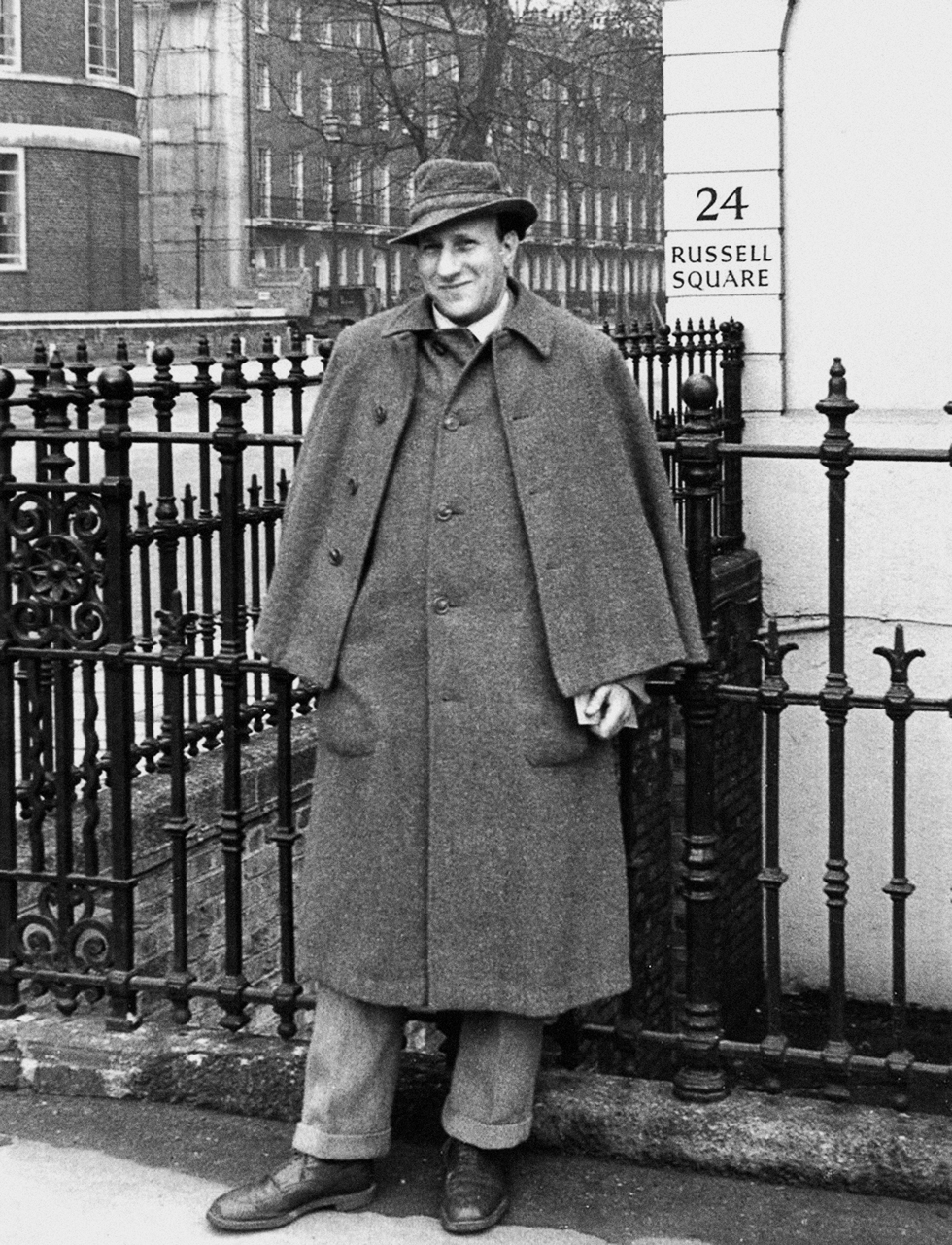
Wolpe joined Faber 80 years ago in 1941, at the tail-end of the Blitz, and one of his first roles involved fire-watching from the roof of the Russell Square office. “Of all the things Berthold heard and saw during this time,” his daughter remembers, “he said one of the most awful was a piano, in flames, falling slowly through several floors of a burning building. He told me it seemed to him like the sound of the end of civilisation.”
In his four decades at Faber, he designed more than 1,500 book jackets, some with hand-torn or handwritten lettering, some with his typefaces Hyperion, Pegasus, Fanfare and Tempest Titling, and many, many more in Albertus. If ever Faber had a house style, this was it. Every letter is a meal in itself, a clear message even before one reads what it has to say. It embodies something steadfastly human, and — despite its origins — specifically handmade in Britain. It engenders old-fashioned, characterful trust. The Faber novelist Joseph Connolly has compared it to the best of Lennon and McCartney: “Still so astonishingly fresh and vibrant, pleasingly shocking in its utter effect.”
Wolpe was pleasingly shocking too. Determinedly shambolic, it was unusual for him to appear in the office until 4pm, spending the mornings trawling London’s skips and bookshops for treasures (and days when he did make it in just before lunch, he would then go for lunch). He wore a trilby and a Sherlock-style cape, and he played the eccentric to the nines. A photo taken in his office in the 1970s shows him holding a pipe, a long flick of hair over his balding pate, a wistful stare, and a room full of detritus and crap.
And he was fuck-you headstrong. The Faber archive contains a spiky correspondence between Wolpe and Lawrence Durrell over the jackets for two of his books. The designer had used a large handprint for the cover of Justine, possibly that of his daughter. When he sent the author a proof, and Durrell voiced his objections, Wolpe replied that his letter had “unfortunately” taken a while to arrive, and the jacket had already left for the printer, “and I am sorry to say it was therefore impossible to make any alterations.” Durrell then railed against Wolpe’s jacket for his novel The Dark Labyrinth: “It seems to me beyond horrible. This dreadful puce! And I really think that two drunken snails dipped in permanganate could have produced more aesthetically pleasing shapes.” Wolpe didn’t change the book’s cover. There is no record of any disquiet from the author over the jacket for his travel book Bitter Lemons, nor for Durrell’s Collected Poems, both of which used Albertus.
Today at Faber, designer Peter Adlington welcomes the “confounding ability” of Albertus to apply itself to so much so well. “It can appear whimsical, definitive, literary, threatening, quiet…” His fellow designer Jonathan Pelham notes other diverse identities: “Modern yet old fashioned, stiffly formal yet faintly eccentric, folkloric yet empirical. Often it can embody two seemingly opposing qualities at once. It can be used to communicate a huge range of messages, but unlike the expressly universalist modernism of Helvetica or Univers, it doesn’t flatten the effect behind the message in the process.”
When choosing Albertus for the Bowie show, Jonathan Abbott also saw that “slippery middle ground” between modern and traditional, sans and serif. “Its classical proportions speak to me as something quite elegant — almost architectural. Perhaps these coexisting qualities explain why it’s been put to such a variety of uses. When a typeface is fashionable for a brief period, years later it can feel very much outdated. But because Albertus is an historical typeface, it somehow transcends fashion — being neither in, nor out. Perhaps this is a clue to its timeless aura.”
Wolpe’s achievements did not go unrecognised. He received an OBE in 1983 and an honorary doctorate from the Royal College of Art a year later. Foreshadowing Bowie, he had his own retrospective at the V&A in 1980, a show that included Albertus on coins (the now defunct five-shilling crown) and a vast array of menus, invitations and memorial stones. Astonishingly, Wolpe received only a one-off payment for Albertus and his other typefaces, and no royalties, and he never campaigned for more. He died at the age of 83 in 1989, and each year since the memories and myths have grown fonder and deeper.
But here’s the biggest thing: we are all the perennial beneficiaries of his talent. Last year, another of Wolpe’s typefaces, Pegasus, a similarly bold alphabet with a hand-cut feel, was adopted for Faber’s new branding, while the popularity of Albertus shows no sign of waning. In 2017, Toshi Omagari of Monotype Studio released Albertus Nova, a digital update in five weights, light, thin, regular, bold and black; the whole family available for download on any machine for £85. The face continues to illuminate the jackets of new publications almost every week, most recently the novels A Burning by Megha Majumdar and This One Sky Day by Leone Ross; the poetry collection A Blood Condition by Kayo Chingonyi; the Graham Greene biography Russian Roulette by Richard Greene; and the memoir Heavy Light by Horatio Clare.
Donna Payne, Faber’s creative director, remembers that when she joined the company 15 years ago Albertus “almost had its own office”. “It’s incredibly hard to make it look bad,” she says. “It even looks good on a phone, it just lends a literary quality to everything. The only problem is that it can make a designer lazy; the familiarity means you have to work harder to create something innovative. I’ve tried to deconstruct it, but no matter what you do with it, even with horrible spacing, it always manages to look beautiful. There’s just something magical about it.”
