Pink is back. You might not have noticed - after all, the pink we're talking about is a not-quite-pink pink, a pink that is harder to pin down than the Barbie's dream house Pantone 219C you were taught to hate as a child.
It's a pink that encompasses barely-there dusty rose, faded peach, muted apricot, dull salmon and charged terracotta shades, known collectively as 'millennial pink' - and it's f***ing everywhere.
Once you notice it, you can't stop. It's spread across fashion retailer billboards, suede trainers dangling out of trendy streetwear trousered legs and - crucially - some of menswear's leading celebrity trendsetters from Beckham to Drake to Frank Ocean to Tom Hiddleston. But where did it come from and how did it get there?
Last August an article by New York Times fashion off-shoot The Cut drew attention the pale pink prolifilation and gave it its timely monicker: 'millennial pink'; the ironic, post-pink for the Instagram generation. "A cohort raised to distrust pink has turned contrarian and embraced a muddied, faded version of the color [sic]," Lauren Schwartzberg wrote.
Other names have been thrown around for the trend, including Scandi pink and Tumblr pink, but whatever you call it, it's a soothing, self-care shade that packaging designers know make everything look nice and manages to both catch your attention and fade into the distance.
SEE ALSO: How The White Trainer Took Over The World
Its story begins with Pantone's choice for 'colour of the year' in 2016, when for the first time the experts chose two shades: Rose Quartz (a light pink) and Serenity (a light blue). The former was bang on the style zeitgeist and started cropping up everywhere. Having seen the staying power of the shade, Pantone included a lighter shade of Rose Quartz named "Pale Dogwood" in its spring 2017 fashion colour report.
In an article titled "The colour start-ups are putting everywhere", The Ringer reported that: "Brands like Acne Studios, Glossier, Kinfolk, and Thinx incorporated it in their shopping bags, websites, magazine covers, and ad campaigns. In October, fashion startup Everlane teamed up with Opening Ceremony for a line of clothing from the same family of pinks and beiges."
As well as having several monikers, the pink wildfire grew beyond the dusty rose hue of Pale Dogwood into many different shades. As The Cut commented in a follow-up piece this week: "By the time everyone started calling it Millennial Pink in the summer of 2016, the color had mutated and expanded to include a range of shades from beige with just a touch of blush to a peach-salmon hybrid."
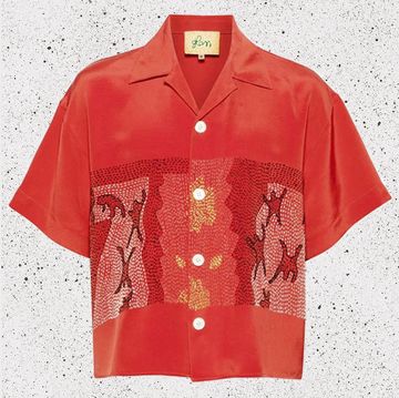
Though admittedly millennial pink is more of a howling force in women's markets when it comes to books, bags and boots, it is slowly but surely seeping into the world of men's fashion and marketing too. See evidence in the faded blossom suede on Common Projects trainers and a warmer apricot shade smattered throughout Acne's mens collections and packaging. Pink hues have invaded CMMN SWDN's camp collar shirts and Oliver Spencer's shirts and t-shirts have been dyed the same hue.
Pastels for spring isn't exactly groundbreaking, but designers right now can't get enough of muted shades of pistachio, duck egg blue and lavender and the crossover of these traditionally feminine tones perhaps shows we're at a post-gender point with colour.
Schwartzberg writes that the trend, "Speaks to an era in which trans models walk the runway, gender-neutral clothing lines are the thing, and man-buns abound. It's been reported that at least 50 percent of millennials believe that gender runs on a spectrum — this pink is their genderless mascot."
But is it a trend if we're all looking at five different shades of one family of colours and claiming it's the same thing? Slate this week called bullshit on tumblr pink mania saying, "I can't believe this needs to be pointed out, but none of these things are the same colour."
Perhaps 'millennial pink' - whichever version you're looking at - is significant as an emblem of an age both ostensibly post-gender and, at the same time, obsessed with gender politics, a palette of 'wokeness' and a soft-hued sign of the times.
Or perhaps we're just looking too much into it. It's just a nice shade of pink after all.
Clockwise from left: CMMN SWDN, £205; Common Projects £290; Acne Studios £700; Oliver Spencer £95; Norse Projects £135; Filing Pieces £200


