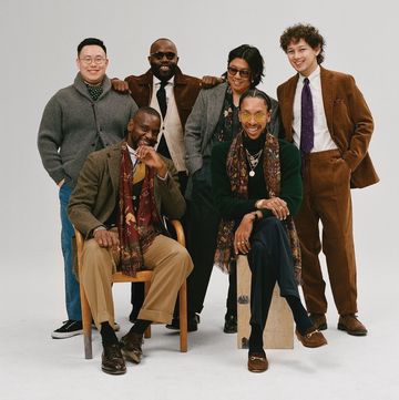
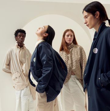
Who would have thought that one of the best-selling colours for men last summer was dusty pink? Well, it was. It was such a success that it looks as if it will top the colour charts again this summer, since all the designers have hit on the hue once more. There are shades of dusty, neon, pastel and flesh pink on everything, everywhere. Come rain or shine, it seems we’ll all be looking exceedingly pink and perky. Well, perhaps not perky. However delectable the colour may be, it can be a tricky one to wear; especially when nearer the dusty end of the spectrum.
I’m wearing a pale pink sweatshirt as I write this column. I’m a method writer in case you didn’t know. I don’t write this page, I live it. The sweatshirt is cotton jersey, a great fit, and is by Holiday Boileau, the brand owned by the editor of French Vogue’s husband. So far, so good. There are, however, two small downsides. One is the fact it says “Holiday” across the front. Nothing wrong with a cheering slogan at all, except that I’m sitting at my desk, in an office of around 800 people, on the top floor of Westfield London shopping centre in a smog-filled corner of Shepherd’s Bush. You couldn’t really get less “Holiday” than that (even if you’re sitting on the terrace of the new John Lewis café with a bottle of juice and a straw). Clearly, my sweatshirt is telling a damned lie. Second problem is that the dusty pink colour effortlessly matches the pale, sun-deprived flesh tones of my face; it’s tricky to tell where my neck stops and my clothing starts. I look like a giant finger with a face drawn on it. Does anyone remember the old TV show Fingerbobs? There’s a reason why there was only one series.
It’s no surprise men have wholeheartedly embraced the colour, of course. First of all, we’ve been fearless about bold colours and patterns for yonks now. Grrrr! we say when someone throws a pastel in our direction today. Pop into the changing rooms downstairs in the Gucci store on Bond Street and it’s heaving with firefighters and farmers from the Home Counties salivating over bright pink sweatshirts with pictures of teddy bears on the front, or knitwear emblazoned with pictures of Snow White. There’s a particular shade of pink — the aforementioned fleshy one — that has become so fashionable it’s even been given its own name: millennial pink.
And it’s not just covering clothes, but entire restaurants and McMansions, too. The dining room in London’s popular Sketch restaurant in Mayfair, designed by the artist David Shrigley, is plastered in pink walls and banquettes, and newspaper property pages recently reported that multi-million pound mansions at the top end of the market struggling to sell were suddenly finding buyers if they replaced their neutral Kelly Hoppen-style colour palettes with a lick of millennial (or million-ial) pink paint.
Ask the experts why and, predictably, they’ll bring up the subject of gender politics, Brexit, Trump and the Pink Pound (I made that up), the reality is more likely that it shows up well on Instagram. And, unless like me you’re wearing your dusty pink in that bucolic-sounding triangle of concrete between Shepherd’s Bush, Wood Lane and White City, pink is a colour that conjures up sun-drenched holidays in the Balearics: think early-morning beaches of San Antonio littered with flesh-coloured condoms; or the rain-spattered bins at the end of Cheltenham Ladies Day overflowing with plastic beakers of blush Prosecco; and that happy interim colour between pink and pale brown that you spot halfway down the doner kebab rotisserie and pray to God won’t end up in your takeaway carton.
I suppose the world is so bleak at the moment, the tastemakers have decided we all need a lick of millennial paint to cheer us up. It will help if we look at everything through rose-tinted spectacles, or through the bottom of a glass of rosé, or while wearing a pale pink sweatshirt that says “Holiday” across the front.


